I am going to evaluate the positive and negative outcomes of online blogging. The positves are that you are able to share your work with others over the web which is useful for artists and industries wanting to promote and sell work/products. You can also view other peoples blogs that interest you and look at the kind of work they create and what interests them. After creating my own blog i have realized that you can learn quite a lot of information by reading through other peoples work. I also like the fact that you can keep up to date with recent posts from these blogs by following them. These will come up in your blog list. This is a list of all the blogs you follow. By using blogs you will be able to find people with the same interests as you.
There are also negatives when it comes to blogging. As well as using the computer to create posts, most people also use their mobile phones. The only problem with this is that it takes a lot longer to upload work such as the images so it would be a lot faster to blog from your PC. I suppose blogging from your phone is also a good thing because this means that you can blog when and where you want, you don't always have to be sat at a computer. When it comes to blogging Plagiarizing is also a problem because people don't copyright their own images/text so its easy for someone to copy and pass it off as their own work.
Tuesday 14 December 2010
Greg Gossel
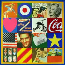
Greg Gossel is a graphic designer born in Baldwin, Wisconsin in 1982.
His work is about life, the struggle, and the beauty. He said "I try to accomplish this through the interplay of many diverse words, images, and gestures. Im interested in process, building up a surface and layering a variety of mediums; spraying, printing, splashing, erasing, dripping, and writing in a very loose and spontaneous way. When a piece is finished, I want it to illustrate a visual history of change, process, and expression". So each piece of Gossel's multi-layered work illustrates a visual history of change and process. He is also dedicated to his personal work, and has been exhibiting his fine art locally and nationally for the past two years. His work has been exhibited throughout the U.S. and abroad, including San Francisco, New York, Los Angeles, Milan, and London.
Below are some images of Greg Gossel's work


Saturday 11 December 2010
Blog of an Art Admirer and History Lover
In this blog there are loads of posts on artists from different countries such as Japanese Artists, Austrailian Artists and Greek Artists. A lot of interesting work has been posted created by loads of artists. I quite like the pencil drawings of the cats by Paul Lung called 'My Own Cat Tai Fu' and 'SaiLoLo' aswell as 2 illustrations i particularly like created by 'Mayumin' a Japanese Illustrator.
'My Own Cat Tai Fu'

'SaiLoLo'


'My Own Cat Tai Fu'

'SaiLoLo'

Below are 2 Illustrations created by Mayumin


Graphic Design
After reading through some of the posts posted on this blog i think it's quite boring even though it's simple to follow. Not much information is posted which doesn't make it to complicated. I do like the '35 Conceptual Black and White Photography - concepts captured' post beacuse i find the images interesting such as 'Prayer' and 'Smoke on the Moon'.
'Prayer'

'Smoke On The Moon'

'Prayer'

'Smoke On The Moon'

Mi Fashion
This is one of my faveourite blogs i am following. There are loads of posts on fashion such as fashion news, Giveaways, Celebrity Looks etc. I enjoy reading all the latest fashion news on the clothes celebrities have been spotted wearing and the Fashion tips posted. There are loads of different categories and posts to do with Fashion on this blog. By looking through this blog you can find out about fashion events that will be happening in the future and fashion on the Catwalk. There are also a few designer posts. The latest post is on Jessica Simpson saying her fashion empire is due to hit $1 billion in sales next year according to Womens Wear Daily which is a fashion bible.

Venetian Red
This is one of the other blogs i have also been following. I quite like the layout of the blog and the dark colours used because it represents the word 'Venetian Red' which is natural earth clay tinted by iron oxide. The color ranges from deep red to brownish red, depending on the content of iron oxide in the soil.

I find some of the work posted on here quite interesting. Work on the Greek Goddess 'Wise Athena' have been posted. There are loads of different images of sculptures of the Goddess which have been posted with explanations that i find quite interesting to read about.

Claire Murray- Illustrator
This is one of the blogs i have been following. I find this blog quite interesting because i like the illustratios she posts. Recently she has posted an illustration of the band 'One Direction' which i think is great and some of the other X Factor contestants which i think are all fab. She has also posted illustrations of characters from other TV shows such as 'Im a Celebrity Get Me Outta Here' and 'Big Brother'. Other Illustrations have also been posted such as Animals, Fashion, Christmas and loads more!!!!


Tuesday 7 December 2010
Debbie Smyth
Debbie Smyth is a textile designer. She uses techniques like knitting, knotting, basket making and orgami. Some of her work is created by stretching threads between plotted pins. This style was developed through training at West Wales School Of Artsand since graduating, over the past 2 years her work has progressed. She describes herself as constructed textile artist. Her work employs "an array of mechanisms, she folds, collapses, inflates and interlocks her materials to transform two dimensional lines and planes into three-dimensional shapes and space". Her work has already been exhibited at new designers, tent London and she's done several exhibitions nationally and internationally. Debbie Smyth was selected as one of the most promising graduates of 2008 for the Dezeen Talent zone at the London Design Festival. She drew electricity pylons across several canves panels using sewing pins and black thread. She stretched the thread between the pins. The technique transforms ordinary structures into small graphic drawings.


The pictures below are images of the 'Pins and Threads' a drawing of electrical pylons artwork created by Debbie Smyth


Robert Banksy
Banksy was born in 1974 and is a Graffiti artist from Bristol, UK. His artwork has appeared throughout London and other countries around the world. He uses street art form to advertise different views of politics from those promoted by the mainstream media. His street art and epigrams combine dark humour with graffiti that is dont in a stencilling technique.
The Political and social commentary artistic works have been featured on streets, walls, and bridges in different cities all over the world. He was inspired by local artists and his work was part of the larger Bristol Underground scene.
Some of his images are combined with slogans. The message is usually anti-war, anti-capitalist or anti-establishment. Subjects often include rats, monkeys, young children, policeman, soldiers and the elderly.
Below are a few images of work created by Banksy


Tuesday 23 November 2010
University's
Name of University: Middlesex University
Course/Level: MA Graphic Design
Description:
You develop a design research project. About three quaters of the programme is developing and completing your subject-specific personal project, comprising creative work with an accompanying presentation or research report. This work is supported by group meetings and reviews and by personal tutorials where individual projects are discussed with specialists in the field.
Entry Requirements:
A good honours degree, or equivalent qualification, in an appropriate subject. Candidates are also considered with other qualifications and individuals with a minimum of three years work experience. Without formal qualifications you need to demonstrate work experience and the ability to study at postgraduate level.
Name Of University: Sheffield Hallam
Course/Level: BA/MDes Graphic Design
Description:
In this course you are encouraged to experiment and challenge the conventions of graphic design. In the first year you can experiment areas within graphic design such as advertising, illustration, structural graphics, typography, moving imagery. As you progress on the course you can specialise in one of these areas. While on the course you will be involved with live briefs and competition based projects, and you can also study abroad. Other study topics are printmaking, life drawing, and photography.
Entry Requirements:
260 UCAS tariff points and a portfolio-based interview
UCAS Points:
260 UCAS tariff points
Name Of University - University Of Derby
Course/Level - Visual Communication (Graphic Design) BA (Hons)
Description:
In this course you produce challenging and original creative ideas during the graphic design projects, which gives you an advantage over others in the creative industries. You explore exciting and fast evolving areas of graphic design, which includes the latest developments in design, publishing, branding, advertising identity, the internet, screen based and moving image and contemporary practice in communication arts.
UCAS Points - 180
Name Of University: University of Hertfordshire
Course/Level: Graphic Design & Illustration BA (Hons)
Description:
You wil work on a variety of real projects and provide answers to communication problems. You will also gain valuable insight into working with real clients. This course teaches you to have great ideas and focuses on developing specific skills that are used in the international visual communications industry.
You can choose to specialise as you progress through the course with either a BA (Hons) Graphic Design or BA (Hons) Illustration. You can also follow the BA (Hons) Graphic Design and Illustration route if you want to do a bit of both.
Name Of University: University Of Bolton
Course/Level: Graphic Design BA (Hons)
Description:
This course is built on a series of deverse and challenging practical assignments. In this course you will learn theories and practice across a broad range of graphic design media. This includes TV, film, the web, packaging, publishing, advertising and corporate and editorial design.
This will give you a strong foundation in design principles, essential professional skills and specialist areas of the industry.
Entry Requirements: 200 UCAS points from at least two A2-levels (or equivalent) in any subjects, plus five GCSEs at grade C or above (or equivalent) including English. Also interview and portfolio of appropriate work.
UCAS Points: 200 UCAS
Name Of University: De Montfort University Leicester
Course/Level: Game Art Design BA (Hons)
Description:
This is a specialist art course that combines traditional fine art practice with contemporary game development technology to develop skills and knowledge that are in high demand across a range of creative industries. The course has three distinct themes which are Visual Design, Game Production and Critical Game Studies.
Entry Requirements:
Good portfollio and either:
- Successful completion of an art and design foundation course
- National Diploma MMM in a relevant subject
- 260 UCAS points at A level to include at least grade C in art or design subject
- Progression or Advanced Diploma with 260 UCAS points, to include art or design
- International Baccalaureate, 28 points
Tuesday 16 November 2010
Artist Research
Richard Hamilton


Peter Thomas Blake was born 25 June 1932, in Dartford, Kent. He is an English pop artist. During the late 1950s, Blake became one of the best known British pop artists. His paintings included imagery from advertisements, music hall entertainment, and wrestlers, often including collaged elements. He painted collage-like pictures of pop musicians and filmstars.
David McKean was born 29 December 1963 in Maidenhead, Berkshire. He is an English illustrator, photographer, comic book artist, graphic designer, filmmaker and musician.His work incorporates drawing, painting, photography, collage, found objects, digital art and sculpture.

Richard Hamilton was born 24 February 1922 and is an English painter and collage artist. His 1956 collage titled Just What Is It that Makes Today's Homes So Different, So Appealing?, produced for the This Is Tomorrow exhibition of the Independent Group in London, is considered by critics and historians to be one of the early works of Pop Art. He combined elements of photography and painting in his pictures. During the 1980s he studied the opportunities provided by digital media and their effect on image perception and fine arts.
Just What Is It that Makes Today's Homes So Different, So Appealing?

April Greiman
April was born in 1948 and is a Graphic Designer who works with digital imaging. Layers or letters and pictures are used because she creates collage like work. April’s work is often identified for it’s 3D effect. She has experimented with Typography and image replacement and she is recognised as one of the first designers to embrace computer technology. She has created posters as well as photomontages and experimented with videos and digital photographs. She has won many awards for her work. She was one of the most influential graphic designers using the digital media.

Rene Magritte
Rene Magritte was born in Lessines on 21st Novemeber 1898-15th August 1967. He was a Belgian surrealist artist And became well known for all the witty images he created. His work is based on ordinary objects but presented in an unusual way to make them look surreal and different, also giving new meanings to familiar things. His paintings exclude symbols and myths; everything is visible. Magritte worked from several sources, which he repeated with variations: anatomical surprises, such as the hand whose wrist is a woman's face; the mysterious opening, where a door swings open onto an unexpected vista; metamorphic creatures, such as a stone bird flying above a rocky shoreline.

Peter Blake
David McKean

Blog Review - http://www.artistsandart.org/2009/07
I like the choice of colors used in this blog for the background. I think by using more than one colour, gives a more interesting effect. The layout is really simple because there isn't much text, mainly images of artists work have been posted. The writing is quite easy to understand because the font is simple but some of the text is a bright green and small which makes it more difficult to read. A lot of images of the artists work have been posted. These images are quite interesting and brighten up the page. By having more images and less text makes this blog more visual and captures the readers interest.
Blog Review - http://venetianred.net/2010/01/16/hannah-hoch-the-good-girl-with-big-scissors-part-i/
Black and Grey have been used for the background which gives it a dull effect but the red used for the title background brightens up the page slightly. The style of writing stands out because the yellow writing is floralessent so it catches the reader eye. The white and red writing also stands out. The image posted looks looks fiery because of the red's used. The layout is simple because paragraphs have been used.
Blog Review - www.graphicdesignblog.org/hidden-logos-in-graphic-designing
The design of this blog is simple and easy to follow. The background color is white so all the text is easy to read because no bright colours have been used. The layout is basic because the page has been set out into sections making it easy to navigate. The text is in different fonts with section headings in bold, highlighting what each section is for. The images posted are logo's which helps the reader understand what the text is about.
Computer Arts 171 - The design secrets issue
Josh Cochran
Josh Cochran is a New York illustrator. By reading this article i have found out that he has been gradually building his illustration career with a style that combines the flair of a comic book artist, hand drawn detail and colour combinations created in Photoshop. I have also found out that his style of illustration is 'drawing and printmaking mashed together' and that comic books have influenced his work such as 'The Adventures of Tintin' and the 'The Adventures of Asterix'. I like some of the work displayed in this magazine, such as 'Mountain Dew Commercial' which were put into motion by the animators at production company Buck. I think the bright colours used makes each image stand out. Cochran said ' The process was a learning experience for me and it was really great to see my drawings expanded to different types of media'. I also like 'Inside Path' which is a tiger and is one of Cochran's personal works. He used pieces of paper found in old books which gives the final piece of work a good effect.
Mountain Dew Commercial

Inside Path

Links
http://www.joshcochran.net/
Josh Cochran is a New York illustrator. By reading this article i have found out that he has been gradually building his illustration career with a style that combines the flair of a comic book artist, hand drawn detail and colour combinations created in Photoshop. I have also found out that his style of illustration is 'drawing and printmaking mashed together' and that comic books have influenced his work such as 'The Adventures of Tintin' and the 'The Adventures of Asterix'. I like some of the work displayed in this magazine, such as 'Mountain Dew Commercial' which were put into motion by the animators at production company Buck. I think the bright colours used makes each image stand out. Cochran said ' The process was a learning experience for me and it was really great to see my drawings expanded to different types of media'. I also like 'Inside Path' which is a tiger and is one of Cochran's personal works. He used pieces of paper found in old books which gives the final piece of work a good effect.
Mountain Dew Commercial
Inside Path
Links
http://www.joshcochran.net/
Computer Arts 173 - "Good designers seem to be looking for authenticity rather than tendencies"
Kathryn Hudson
Kathryn Hudson is an Illustrator. By reading this article, I have found out she hand draws her work amd inks it using pens then she scans it onto the computer. She uses Photoshop for the colour. I quite admire her style of work. I like the dream - like effect she creates in each piece of work by using a muted colour scheme. I also found out that ever since she's been using Photoshop, she has been digitally colouring her Illustrations and developing her skills by doing this. She creates 2 styles of work. She creates 'Illustrative' work, this is aimed at commercial and editorial work. Her stylised look is for the childrens publishing market. I really like the pictures of her work displayed in this magazine. In one of her pieces 'The Departed Spiral', she has experimented with mood through geometry, textures and colour. I really like the choice of colours used because it gives a calm effect. In the picture 'Nest' her aim was to take her illustrative style into editorial and fashion publishing. I really like this piece of work because I think the birds in her hair gives a strange/weird effect.
Nest

The Departed Spiral

Links
www.nbillustration.co.uk/Kathryn-hudson
http://www.katillustrations.com/
Kathryn Hudson is an Illustrator. By reading this article, I have found out she hand draws her work amd inks it using pens then she scans it onto the computer. She uses Photoshop for the colour. I quite admire her style of work. I like the dream - like effect she creates in each piece of work by using a muted colour scheme. I also found out that ever since she's been using Photoshop, she has been digitally colouring her Illustrations and developing her skills by doing this. She creates 2 styles of work. She creates 'Illustrative' work, this is aimed at commercial and editorial work. Her stylised look is for the childrens publishing market. I really like the pictures of her work displayed in this magazine. In one of her pieces 'The Departed Spiral', she has experimented with mood through geometry, textures and colour. I really like the choice of colours used because it gives a calm effect. In the picture 'Nest' her aim was to take her illustrative style into editorial and fashion publishing. I really like this piece of work because I think the birds in her hair gives a strange/weird effect.
Nest
The Departed Spiral
Links
www.nbillustration.co.uk/Kathryn-hudson
http://www.katillustrations.com/
Monday 15 November 2010
Blog Review - www.claireymurray.co.uk
I quite like the design of this blog. I think the background has an old paper effect. I like the images posted because they are brightly coloured which gives a good effect. The text is simple because it's black and in a readable font. I think the size could bbe bigger to make it easier to read. The layout is simple but I think boxes could have been used.
Blog Review - www.mifashionblog.com
I think this blog is quite attractive because i like the background which is black with poker dots. I also think the different pinks used for the 'Fashion' title stands out. The layout is also quite simple as there is a box for each advertisement. There are only a few images which are to represent each advert. The style of writing is simple so it's easy to read. No fancy font has been used. Most of the text is black but each header and the comments, tags and the text saying where it was posted is in bright pink which makes the text stand out and more noticeable.
How have living room's changed since the 1950's???
Since the 1950's, all of the furniture and fashion has changed. In the 1950's most people were quite poor so they had radio's and only a few people had TV's which were black and white. In the late 70's technology improved so TV's were in colour and were larger, also since then TV's keep on improving every year because now most people have flat screen TV's and there are a range of different sizes available. HD TV's are also available now. In the 1950's everyone had a coal fire but now people either have Gas/Electric fires and central heating. Everyone used to have a mantle piece surrounding the fire to make it look fancy but now it's fashion to have your living room plain. It was also fashionable to have flowered/patterned wallpaper, different patterned carpets, curtains and nets. Since then the fashion has changed because a lot of living rooms are ow plain, so the walls are painted instead of decorated in patterned wallpaper. Most people also usually have plain carpets or wooden/laminated floors and blinds instead of curtains. The fashion back in the 1950's was to also have a single standard lamp or ceiling light. Now there are many different sorts of light for living rooms including wall lights and down lights. A lot of furniture in the 1970's was made out of dark wood and most living rooms had a large sideboard and dining table. Many living rooms do not have dining tables as they have seperate dining rooms or have large kitchens where food is eated as well as prepared. The only furniture in living rooms now might just include 'chests' that store DVD's, photographs etc and a corner unit to stand the television on. Even the television corner unit is slowly disapppearing as more televisions are being fastened directly to the wall using brackets.

1950's Living Room

Modern Living Room
1950's Living Room
Modern Living Room
Ceri RIchards
Ceri Richards was born in Dunvant, near Swansea. He attended a summer school where he became interested in modern art. His work gradually moved towards surrealism after exposure to the work of Picasso and Kandinsky.
The picture below was made during the second World War so it refers back to Mussolini's invasion of Abyssina in 1935. Ceri has painted flowers to represent the bombings and explostions. He has also painted aggressive plants to represent the aeroplanes. Richards commented "These paintings, obscurely maybe, make flowers into explosions or vice versa, aeroplanes look like aggressive plants, and an incendiary sun rises over the landscape". Instead of just copying a photo etc, he has used his imagination to expand what is going on around him and use a range of different colours so it doesnt look as depressing.

The picture below was made during the second World War so it refers back to Mussolini's invasion of Abyssina in 1935. Ceri has painted flowers to represent the bombings and explostions. He has also painted aggressive plants to represent the aeroplanes. Richards commented "These paintings, obscurely maybe, make flowers into explosions or vice versa, aeroplanes look like aggressive plants, and an incendiary sun rises over the landscape". Instead of just copying a photo etc, he has used his imagination to expand what is going on around him and use a range of different colours so it doesnt look as depressing.
Tuesday 9 November 2010
Festival Of Britain
The Festival Of Britain was a national exhibition which opened in London and around Britain in May 1951. It was a festival that celebrated the nation's recovery after the second World War. The main exhibition site was on the South Bank Site in london on the River Thames near Waterloo Station. Other exhibitions were held in Poplar, East London (Architecture), Battersea Park (The Festival Gardens), South Kensington (Science) and the Kelvin Hall in Glasgow (Industrial Power) as well as traveling exhibitions that toured Britain by land and sea. Outside London major festivals took place in Cardiff, Stratford-Upon-Avon, Bath, Perth, Bournemouth, York, Aldeburgh, Iverness, Cheltenham, Oxford and other centres. Most of London was still in ruins and redevelopment was badly needed. The festival was to give better quality design when re-building British towns and cities. It was also aimed to raise nation's spirits whilst promoting British art.


Abram Games
Abram Games was born in 1914 in White chapel, London and died in 1996. He was a British Graphic Designer during World War II. He designed posters, packaging and he also designed posters, signage and packaging for the BBC, Shell , The Financial Times, Guinness, and the London underground. During World War II, he was England's official war poster designer. He designed stamps for Britain, Jersey and Israel. Also he designed the logo for JFS in North-West London. There were also book jackets for Penguin books and logo for Festival Of Britain and the Queen's award To Industry. He oversaw the design and production on hundreds of posters for Britain's to stand fast and support allied troops.
 |
| Add caption |
 |
| Add caption |
 |
| Add caption |
 |
| Add caption |
Henry moore
Henry Moore was born in Castleford West Yorkshire on 30th July-31st August 1986. He was an English Sculptor and artist. His work was based on the human figure and he is also an official war artist because he drew pictures of people sheltering in the London underground during the blitz.


Subscribe to:
Posts (Atom)