Tuesday 29 November 2011
Examples Of Designers And Their Work
I have researched and given examples of work of 5 different designers, saying what i like about their work. I have also researched 3 other topics - Leaders, Scientists, and Gods. They are all exceptional in their own field. All the designers i have chosen are exceptional in their field because they are all succesfull and famous worldwide. All the Leaders i have used as examples are exceptional because they have been elected by the majority of people. They earn the respect of the public and are powerful. The Gods/Goddesses are made famous throughout history and were worshiped by millions of people. Stories have been circulated worldwide and they all represent a force of nature. The examples of scientists i have given have all made discoveries and created theories that have effected the way we live.
Wednesday 5 October 2011
Sculpture Park
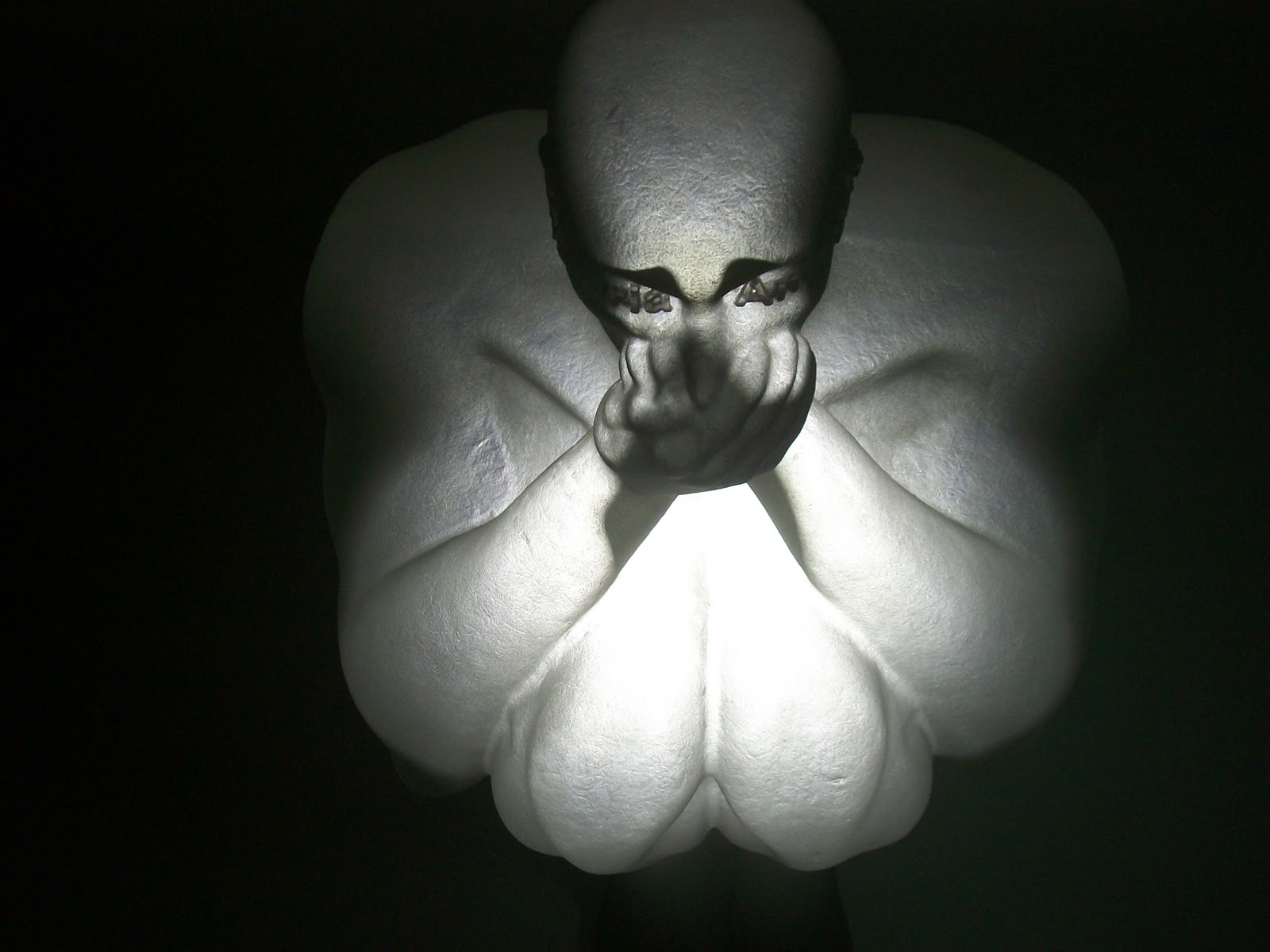
On Thursday 29th September i went to the Yorkshire sculpture park to look at all the different sculptures by different artists to give me ideas for the Tapton Grove project. I looked at work created by Jaume Plensa and noticed that he has focused on the human body and has focused on these themes: love, memory, language and despair. I have noticed that some of his works have been created out of metal letters. I quite like this idea for my own project because I like the idea of creating a sculpture out of words because i think it looks effective compared to a few others created by other artists that were a bit too simplistic. I particularlry like the two heads which looks like its been created using metal wire in a 3D dimensional effect giving a transparent effect. I also looked at 'The Heart Of Trees' sculptures which were made out of bronze and tree. Again poetry has been used which i think makes the whole image more interesting. I went round the diffferent rooms looking at what work he had created and noticed In one of the rooms there are three sculptures which are made out of polyester sat in different positions, covering ears, mouth and ears. It is as if he is trying to show suffer and pain.


I also looked at work by Sophie Ryder. Where as Jaume Plensa has focused on the human body, Ryder's work includes human, animal and mythological figures combined together. She has focused on the Lady-Hare which is a head of a Hare and the body parts are focused on her own body as well as the Minotaur which is the head of a bull on the body of a man. Like Jaume Plensa she is trying to show emotions in her work because she uses animal imagery to explore emotion and to communicate feelings and to show that you can see emotion whether you are human or an animal. I quite like her work and I like the way she has combined different species together to form a sculpture. The pictures below are images of her work which look like they have been created out of stone.

I also looked at work by Dennis Oppenheim who is a land artist and was part of an important exhibition 'Earthworks'. He is different to both Jaume Plensa and sophie Ryder because he creates land art works such as trees, flowers and hedges made from steel. The works i looked at were 'Fixture Trees' which are trees made from steel. Household objects are used in each sculpture. One of the trees has bathroom and kitchen objects such as toilets and sinks. On others he has used bins, sheds, chairs and other objects. I found Dennis Oppenheim's work quite unusual, different, clever and something i wouldnt have expected to come across. His works dont seem to show any emotions or feelings compared to the other two artists work.
Sunday 26 June 2011
University Visits
Manchester Metropolitan University
We went round a show at Manchester Metropolitan University looking at different work produced by the students in different Design fields such as Illustration, 3D design, Photography, Architecture, animation, textiles and fashion Design. I thought the layout and structure of this show in each design field was very professional and the displays of work were appropriate and presented at a professional standard.
I really enjoyed looking at the different work produced, which also helped and gave me ideas. By looking at students work made me also realise how much work you have to put in to each course. I found most of the work interesting especially in 3D Design, Illustration and Architecture. I am definitely going to consider 3D Design, looking at all the displays made me realise that this might be the course for me. There were loads of displays of different projects displayed around the room. One of the benefits of going to this art show is finding out about 3D design because otherwise I wouldn’t be considering this course if I hadn’t seen any of the work produced.
Another course I particularly like is Illustration. I think all the work was produced at a very high standard. I looked through a Portfolio of different designs and images produced, such as characters and detailed shapes, such as circles and hearts. As soon as you enter the room, there are displays of different work around the room and in the centre. This is another course I am going to consider because I am interested in the kind of work involved in this course. After looking at the displays I am now wondering if this course would be too difficult for me, even though I am interested and would love to do it.
I looked at fashion design. I thought the dresses that were on show were created with imagination and ‘alternative’ ideas. They were original, eye opening and were more like works of art rather than something I would wear. I really enjoyed looking at all the different styles. The work put in will have been time consuming.
We looked at Architecture and even though im not considering doing this course, I thought the quality of the work and the skills used to create each piece of work was at a high standard. By looking at the work, I think to do this course you have to be good at drawing.
I didn’t have time to look at inspiration but I think everyone will have started somewhere whether its looking at other peoples work for ideas then using them to influence your own work or even an artist style.
Hannah Lovett is an artist /designer/maker whose work was also exhibited at the art show. There was one piece that I particularly like which is called ‘Rebirth’. I quite like the use of materials used forming an object and i think its quite effective. Lovett quoted “The work explores the ’inheritance’ of material and idea. It is about a series of happenings in an objects’ life conveying a story through birth of new form.” I found these images of the work I saw at the art show while I was browsing Hannah Lovett’s website.


Sheffield Hallam University
We went to the art show at Sheffield Hallam University. We looked at Graphic Design, Interior Design, Product Design and Games Design. The show has definitely influenced the courses I am going to consider applying for.
One of the courses I looked at was Interior Design. Even though I am not considering doing this course, I still enjoyed looking at the work others have produced in this field. Interior Design doesn’t seem interesting to me but when I arrived the pieces of work that have been produced really caught my attention. I think that the amount of effort shown in the projects has really opened my eyes to the difficulty of this course. All the projects were displayed around the edge of the room and models of buildings were displayed towards the centre.


I went to look at the work produced in Graphic Design which is one of the courses I am interested in applying for. The displays started on the outside walls and continue towards the centre of the room. There were also displays of port folios showing research for each project in the centre of the room. One of the projects that drew my attention was by Emma King. This project was type. She created letters using images of flowers which I found really interesting. The black one is easy to read and understand but the one created using various colours isn’t as effective. Another project that I liked was by Caitlin Totten. She has created images of a burger, apple and a drink using different textures to form an image which makes the food look effective. Lauren Billingham’s work was my favourite because I am working on a similar theme on my course which is designing packaging for a natural product. She has created a skin care range using natural products and natural images.


These images below is the work created by Jessica Treslove. The right image is a picture of the clock she created out of concrete.


These images below are pictures of the work created by Rick Hewitt. The image below underneath the image of the 'Step by step guide' is the ‘SpinCycle’ washing machine.


Chesterfield College
I went round the art show at my college looking at all the different work produced by students. The difference between this show and the previous shows is that this is a foundation course in Art & Design. If I decide not to go to university then this would be a good option for me. The displays were located all round the room. All the display boards were placed at an angle to display each students work.
The first collection of works that I looked at was animation/illustration by Christopher Hogan. His work focussed on music. I like the detail shown in these works, focussed on the playing of instruments. I like the colours used in these graphics because I like the contrast between the neutral colours and the red and blue tones.

My favourite display was the work of Megan Lolly. She has used type to create images. Each image spells out a different word e.g. the letters spelling ‘Fish’ create the fish shape in one of the images. This display is interesting and she has used a lot of imagination to create these graphics. These graphics look like simple graphics until you look closely, and then you can notice how clever and effective they are. You can see how the words create each graphic and the detail in each image. The Apple Graphic is my favourite. She has taken the theme of ‘Apple’ and created a graphic using an Apple shape outline with a New York ‘Big Apple’ image inside it. She has then distorted the New York image to create the letters. Megan’s work influenced me because I find her work very talented, imaginative and creative.
These images below are pictures of the work created by Megan Lolly.


All three shows have definitely influenced my ideas and have made me realise which courses I would probably enjoy more than others. It has helped me think about which courses to consider applying for. It also broadened my understanding in each field and made me realise that there are so many other courses in the design field that I would enjoy such as 3D design. To compete with the other students, I would research other graphic designers for ideas and inspiration. I would use the skill and experience I have gained through my college course as a starting point and develop this to a standard capable of achieving a degree qualification. The courses differ in length from one to three years. Visiting the three different venues, made me aware of the choice and variety of courses available to me. If I decide not to go to university, I have an option to do the foundation course at Chesterfield College.

Monday 23 May 2011


 On brown paper I have used black and white charcoal to create this image. I started off using the black to create the outline and then used the white to create more definition.
Sunday 8 May 2011
Illustration Friday - 'Lesson'

Wednesday 13 April 2011
Doctor Who - Title sequence

Friday 8 April 2011
Illustration Friday - 'Duet'

This weeks Illustration Friday is 'Duet'. I decided to create a duet of two girls singing together.
Wednesday 30 March 2011
Illustration Friday - Toy

This weeks Illustration Friday is 'Toy'. I decided to produce a teddy bear image using Adobe Illustrator, which I created using various shapes and the paintbrush tool.
Saturday 26 March 2011
Illustration Friday - Cultivate

This weeks Illustration Friday is Cultivate so i decided to show a farmer's field being ploughed and prepared for the planting of crops.
Sunday 20 March 2011
Illustration Friday - Stir

This weeks illustration Friday is 'stir' so i decided to draw a bowl and spoon. I have also made it look like someone has been stirring the mixture by creating a circular motion.
Sunday 13 March 2011
Illustration Friday - 'Warning'

This weeks illustration is 'warning'. I decided to draw a hand with the 'exclamation' symbol in the middle which emphasizes you to stop.
Improvements:
-Look at a hand for detail
-Take a better photo
-Alter the detail on the hand e.g. the thumb
-Don't do all fingers the same size
-Improve the shading
-Use mix media
Sunday 6 March 2011
An Analytical Review Of Francis Bacon
Francis Bacon was a figurative painter. He was born in Ireland in 1909 and died in 1992. He was well known for bold, graphic paintings showing distorted faces, emotion, feelings, pain , violent mood, showing deep inside rather than appearance.
Bacon started painting in his 20’s but not seriously. He worked in interior decorating and furniture design for a while. His career didn’t start until he was in his 30’s because he was looking for a subject that would interest him. ‘Three studies for figures at the base of a crucifixion’ was his break through in 1944. This work and his heads and figures of the late 1940’s and 1950’s sealed his reputation. From 1950’s he painted single figures, usually male, seated as if suffering in hell. They would appear isolated in glass or steel cages. In the 1960’s he painted mainly portrait heads of his friends. He said he saw images in ‘series’ and painted variations on the crucifixion. He focussed on half human grotesque heads in ‘Heads in a Room’.
Bacon was homosexual and when his lover George Dyer died, his paintings became more personal and themed with death. The materials he used were sundeala boards which were a a cheap alternative to canvas and he painted with oil. Bacon’s technique was using rags, his hands and dust with paint and brush. He painted Triptych which is a work of art divided into three sections. He placed figures behind glass and used photographs as reference material.
He painted distorted faces and the paintings showed anger, horror, violent moods and feelings. He smeared the colours and his brush work changed to smudging and twisting. Bacon was the first to paint homosexual themes, and influence many artists like Lucien Freud.
The subject matter he painted was lovers, friends, artists and himself like Lucien Freud did. He also painted animals and hunks of raw meat . Bacon’s influences were Luis Bunell, Matthias Gruinewald, Diego Velazquez, Rembrandt, Picasso. He was good friends with Lucian Freud.
‘Triptych 1976’ sold at Sothebys for 86 million dollars. “Three studies for a portrait of Lucien Freud” sold for 23 million pounds in February 2011. In 2008 an exhibition of 60 of his works at Tate Britain travelled to Spain and then to New York.
Study After Velaquez’s Portrait Of Pope Innocent x 1953
This is a distorted version of the portrait of Innocent x by Diego Velazquez in 1650. It is One of a series of variation in Velazquez paintings in 1950’s and 1960’s. Pope is shown screaming but his voice is silenced by surrounding drapes and rich colours. The dark colours of the background give a ‘nightmare’ tone to the painting. The curtains are painted to look transparent and appear to fall through the popes face.

Painting 1946
This is a large painting. Flesh is a major part. He was attempting to paint a bird on a field and a chimpanzee in long grass but then he changed his mind. He had no intension to do this picture. He quoted ‘One continuous accident mounting on top of another’.

Two Figures
This is a painting of two male lovers making love.

Self Portrait 1973
This painting shows him suffering from a hangover or a headache and he is painting himself in a bad light. This shows he was as critical about himself as well as the models. He quoted ‘My painting is a representation of life, my own life above all, which has been very difficult. So perhaps my painting is very violent, but this is natural to me’.

Francis Bacon’s paintings shocked people because they were not in ‘good taste’. The pictures of screaming popes and nude men could upset people. I think his paintings are powerful but disturbing because of the face distortion. They show people unhappy and in pain. They remind me of scenes from horror films and they are very interesting.
Webliography
Wikipedia.org/wiki/FrancisBacon
Sunday 27 February 2011
Illustration Friday 'Layer'

This weeks illustration Friday is 'Layer'. I have decided to create a sandwhich combining layers of bread, cheese, ham, onions and tomatoes.
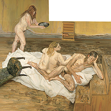
An analytical Review of the work of Lucian Freud
Lucian Freud
Lucian Freud is an artist well known for his thickly impasted portrait and figure paintings, and is known as ‘Greatest Figurative Painter Of Modern Times’. He was born in Berlin on December 8th 1922 and was the grandson of Sigmund Freud the founder of Psychoanalysis. His family moved to England when Hitler came to power because they were Jews. He became a British Citizen in 1939 and attended Dartington Hall School in Totnes, Devon and later Bryanston School. Freud studied at the Central School of Art in London and then at Cedric Morris East Anglian School of Painting and Drawing in Dedham. He also attended Goldsmiths College University of London from 1942-1943.
By 1939 he had several of his drawings published in a magazine called ‘Horizon’. He illustrated a book of poems by Nicholas Moore entitled ‘The Glass Tower’. In 1946 he travelled to Paris and then lived in Greece for Several months. Then he lived and worked in London. When he was 17 he started to socialise with homosexual groups like Stephen Spender and Cyril Connolly. Another influence was his grandfather (the psychologist Sigmund Freud). He brought prints by Brueghel for him when he was a child. Other influences were Frank Auerbach, Francis Bacon, John Minton and Leigh Bowery who were other painters and he painted them.
In 1940 he was interested in drawing the face as in ‘Naval Gunner’. Freud’s early paintings were associated with surrealism and were of people, plants and animals side by side. His technique was using thin paint. He painted ‘The Painters Room’. ‘The Painters Room’ was displayed in his first solo exhibition in 1944 at the Lefeure gallery. From the 1950’s he began to paint portraits and they were usually nudes. His technique changed to a thicker impasto. This was a thick application of oil paint that looked rough texture. He cleaned his brush after every stroke to stop the colours from running. He begins by drawing in charcoal on canvas. Then applies paint to a small area and gradually works outward to form thick layers. He painted naked straight women and gay men. He was noted for his slowness of painting.
He began nude female portraits in 1966 and nude males in 1977. These were painted sitting or lying. His favourite subject was Leigh Bowery. He painted in style of surrealism, realism and expressionism. . Successes include After Cezanne, ‘The Painters Room’ and ‘Girl With A White Dog’.
The Painters Room 1943
This featured an arrangement of objects including a stuffed zebra’s head, battered chaise lounge and a house plant and they all appeared separately in future paintings.

Girl With A White Dog 1952
This was a portrait of Freud’s first wife – Kitty. He liked to paint “pet and owner”. This is his most famous painting. It captures the moment. He uses bold gestures. In this picture the gown slips down her right shoulder exposing a breast and Freud captures the emotions on her face at that moment which include confidence, maturity and apprehension.

After Cezanne 1999.
This was an unusual shape because the top left section has been joined onto the main section. You can see where the two sections join when you look closely. It was sold for 7.4 million dollars to the National Gallery of Austrailia.
Man with Rat 1977
Freud liked to paint “pet and owner”. The use of animals and people side by side. He was interested in homosexuality and painted the reality of the male form.

Freuds paintings show the truth and the individuality of the models. Freud’s subjects were people in his life like family, friends, fellow painters, lovers and children. He said ‘The subject matter is autobiographical, it’s all to do with hope and memory and sensuality and involvement, really’. He used the same people for different paintings to develop a bond. He used friends instead of professionals because he wanted natural and real thoughts and feels of the person. He painted showing all the faults and ugliness and was well known for “capturing the moment”. Some people thought that his paintings showed humiliation and that he considered himself and his views to be always right. I think he was right to paint the truth because not everybody is beautiful.
Webliography
· “Lucian Freud Works On Paper-Great Britain South Bank Board
Sunday 13 February 2011
Essay - Jenny Saville
Jenny Saville
I am writing this as an analysis of the work of Jenny Saville which I feel is controversial. Jenny Saville was born in England in 1970. She is an artist well known for her paintings of big fleshy nudes of women. She studied at Glasgow in 1998 and then went to Cincinnati University for 6 months. She is a feminist and is fascinated with the human body. She spent a lot of time in the malls in America where big women walked around in shorts and t-shirts. She was influenced by feminist texts, photography by Cindy Sherman, fleshy women in the malls and Gustave Courbet’s paintings. These influenced her painting ‘Propped’ and her degree show in Glasgow. All her paintings sold out at her degree show. Charles Saatchi, a gallery owner spotted her work in 1993 at London’s cooling gallery and he bought all the paintings. Jenny Saville spent a lot of time observing plastic surgery in New York which also influenced her. Her work includes ‘Plan’, ‘Hyphen’, ‘Hem’, ‘Fulcrum’, ‘Brace’, ‘Torso’, ‘Passage’, ‘Propped’.
Passage
This is a painting of a transvestite. Jenny Saville wanted to paint a body that was between genders. The transvestite has silicon breasts and the name of the painting ‘Passage’ means a visual passage through gender, from the penis across the stomach to the breasts and then to the head. It is a gender landscape because Jenny Saville said that thirty years ago this sort of body wouldn’t exist.

Hyphen
This is a painting of Jenny Saville and her sister. It looks like a two headed woman. You can see raw canvas splattered with red that looks like blood or mucus membrane. Looks like

She uses pinks, reds and brown to define shapes of huge naked bodies. It is a painting of 3 sleeping huge women. She used strips of tape, painted over them and then tore them off.

Her techniques are oil figure painting. She paints in layers and uses patches of oil colour. She concentrates on disfigurement and graphic detail of the skin. She sometimes uses photography. She used a sheet of glass to distort her body by squashing it and taking photographs from underneath the glass.
Jenny Saville has also painted transsexuals and transvestites. She multiplies the bodies on her paintings so they fill the whole painting. Her paintings are usually larger than life size. She paints the reverse of other figure painters. They paint beautiful so to some people, Jenny Savilles paintings could appear offensive and ugly. Women in our society are obsessed with their appearance. Jenny Saville paints our worst anxieties and shows the bad points instead of beauty. She shows reality and what people can really look like. She concentrates on obesity and paints a lot of detail on the skin pigmentation to show flaws, disfigurement, and the bodies fill the whole paintings.
My conclusion is that her paintings are Frank and show real women and how they think about their bodies. She shows reality because not everybody can have a beautiful body but she thinks big is beautiful. Some bodies are scarred by plastic surgery and she paints these because they are a reality. She has created a place in our society for over weight women. She is the most daring painter of our time. There is feminism in her pictures because men are shut out. She shows human vulnerability. The media presents women as having a perfect body and she does the opposite.
Webliography
Eyestorm.com
guardian.co.uk
artbank.com
Subscribe to:
Posts (Atom)