Tuesday, 29 November 2011
Examples Of Designers And Their Work
I have researched and given examples of work of 5 different designers, saying what i like about their work. I have also researched 3 other topics - Leaders, Scientists, and Gods. They are all exceptional in their own field. All the designers i have chosen are exceptional in their field because they are all succesfull and famous worldwide. All the Leaders i have used as examples are exceptional because they have been elected by the majority of people. They earn the respect of the public and are powerful. The Gods/Goddesses are made famous throughout history and were worshiped by millions of people. Stories have been circulated worldwide and they all represent a force of nature. The examples of scientists i have given have all made discoveries and created theories that have effected the way we live.
Wednesday, 5 October 2011
Sculpture Park
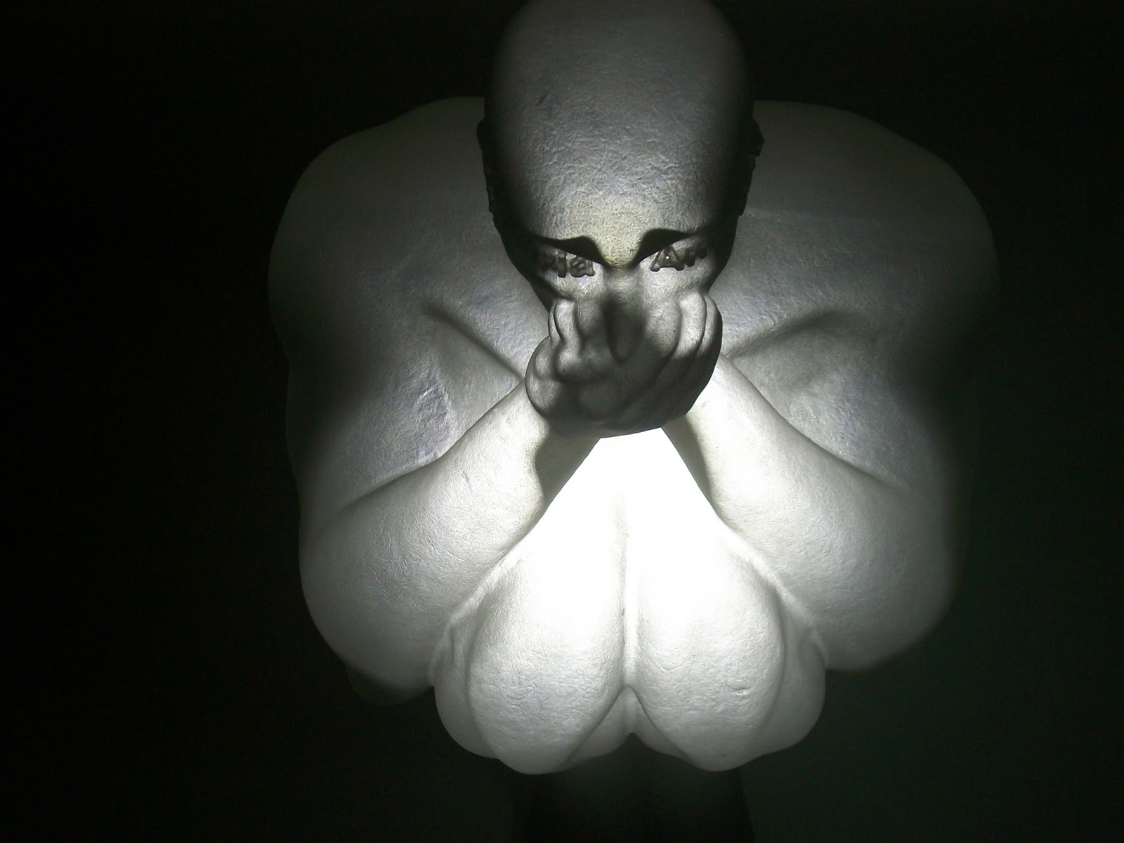
On Thursday 29th September i went to the Yorkshire sculpture park to look at all the different sculptures by different artists to give me ideas for the Tapton Grove project. I looked at work created by Jaume Plensa and noticed that he has focused on the human body and has focused on these themes: love, memory, language and despair. I have noticed that some of his works have been created out of metal letters. I quite like this idea for my own project because I like the idea of creating a sculpture out of words because i think it looks effective compared to a few others created by other artists that were a bit too simplistic. I particularlry like the two heads which looks like its been created using metal wire in a 3D dimensional effect giving a transparent effect. I also looked at 'The Heart Of Trees' sculptures which were made out of bronze and tree. Again poetry has been used which i think makes the whole image more interesting. I went round the diffferent rooms looking at what work he had created and noticed In one of the rooms there are three sculptures which are made out of polyester sat in different positions, covering ears, mouth and ears. It is as if he is trying to show suffer and pain.


I also looked at work by Sophie Ryder. Where as Jaume Plensa has focused on the human body, Ryder's work includes human, animal and mythological figures combined together. She has focused on the Lady-Hare which is a head of a Hare and the body parts are focused on her own body as well as the Minotaur which is the head of a bull on the body of a man. Like Jaume Plensa she is trying to show emotions in her work because she uses animal imagery to explore emotion and to communicate feelings and to show that you can see emotion whether you are human or an animal. I quite like her work and I like the way she has combined different species together to form a sculpture. The pictures below are images of her work which look like they have been created out of stone.

I also looked at work by Dennis Oppenheim who is a land artist and was part of an important exhibition 'Earthworks'. He is different to both Jaume Plensa and sophie Ryder because he creates land art works such as trees, flowers and hedges made from steel. The works i looked at were 'Fixture Trees' which are trees made from steel. Household objects are used in each sculpture. One of the trees has bathroom and kitchen objects such as toilets and sinks. On others he has used bins, sheds, chairs and other objects. I found Dennis Oppenheim's work quite unusual, different, clever and something i wouldnt have expected to come across. His works dont seem to show any emotions or feelings compared to the other two artists work.
Sunday, 26 June 2011
University Visits
Manchester Metropolitan University
We went round a show at Manchester Metropolitan University looking at different work produced by the students in different Design fields such as Illustration, 3D design, Photography, Architecture, animation, textiles and fashion Design. I thought the layout and structure of this show in each design field was very professional and the displays of work were appropriate and presented at a professional standard.
I really enjoyed looking at the different work produced, which also helped and gave me ideas. By looking at students work made me also realise how much work you have to put in to each course. I found most of the work interesting especially in 3D Design, Illustration and Architecture. I am definitely going to consider 3D Design, looking at all the displays made me realise that this might be the course for me. There were loads of displays of different projects displayed around the room. One of the benefits of going to this art show is finding out about 3D design because otherwise I wouldn’t be considering this course if I hadn’t seen any of the work produced.
Another course I particularly like is Illustration. I think all the work was produced at a very high standard. I looked through a Portfolio of different designs and images produced, such as characters and detailed shapes, such as circles and hearts. As soon as you enter the room, there are displays of different work around the room and in the centre. This is another course I am going to consider because I am interested in the kind of work involved in this course. After looking at the displays I am now wondering if this course would be too difficult for me, even though I am interested and would love to do it.
I looked at fashion design. I thought the dresses that were on show were created with imagination and ‘alternative’ ideas. They were original, eye opening and were more like works of art rather than something I would wear. I really enjoyed looking at all the different styles. The work put in will have been time consuming.
We looked at Architecture and even though im not considering doing this course, I thought the quality of the work and the skills used to create each piece of work was at a high standard. By looking at the work, I think to do this course you have to be good at drawing.
I didn’t have time to look at inspiration but I think everyone will have started somewhere whether its looking at other peoples work for ideas then using them to influence your own work or even an artist style.
Hannah Lovett is an artist /designer/maker whose work was also exhibited at the art show. There was one piece that I particularly like which is called ‘Rebirth’. I quite like the use of materials used forming an object and i think its quite effective. Lovett quoted “The work explores the ’inheritance’ of material and idea. It is about a series of happenings in an objects’ life conveying a story through birth of new form.” I found these images of the work I saw at the art show while I was browsing Hannah Lovett’s website.


Sheffield Hallam University
We went to the art show at Sheffield Hallam University. We looked at Graphic Design, Interior Design, Product Design and Games Design. The show has definitely influenced the courses I am going to consider applying for.
One of the courses I looked at was Interior Design. Even though I am not considering doing this course, I still enjoyed looking at the work others have produced in this field. Interior Design doesn’t seem interesting to me but when I arrived the pieces of work that have been produced really caught my attention. I think that the amount of effort shown in the projects has really opened my eyes to the difficulty of this course. All the projects were displayed around the edge of the room and models of buildings were displayed towards the centre.


I went to look at the work produced in Graphic Design which is one of the courses I am interested in applying for. The displays started on the outside walls and continue towards the centre of the room. There were also displays of port folios showing research for each project in the centre of the room. One of the projects that drew my attention was by Emma King. This project was type. She created letters using images of flowers which I found really interesting. The black one is easy to read and understand but the one created using various colours isn’t as effective. Another project that I liked was by Caitlin Totten. She has created images of a burger, apple and a drink using different textures to form an image which makes the food look effective. Lauren Billingham’s work was my favourite because I am working on a similar theme on my course which is designing packaging for a natural product. She has created a skin care range using natural products and natural images.


These images below is the work created by Jessica Treslove. The right image is a picture of the clock she created out of concrete.


These images below are pictures of the work created by Rick Hewitt. The image below underneath the image of the 'Step by step guide' is the ‘SpinCycle’ washing machine.


Chesterfield College
I went round the art show at my college looking at all the different work produced by students. The difference between this show and the previous shows is that this is a foundation course in Art & Design. If I decide not to go to university then this would be a good option for me. The displays were located all round the room. All the display boards were placed at an angle to display each students work.
The first collection of works that I looked at was animation/illustration by Christopher Hogan. His work focussed on music. I like the detail shown in these works, focussed on the playing of instruments. I like the colours used in these graphics because I like the contrast between the neutral colours and the red and blue tones.

My favourite display was the work of Megan Lolly. She has used type to create images. Each image spells out a different word e.g. the letters spelling ‘Fish’ create the fish shape in one of the images. This display is interesting and she has used a lot of imagination to create these graphics. These graphics look like simple graphics until you look closely, and then you can notice how clever and effective they are. You can see how the words create each graphic and the detail in each image. The Apple Graphic is my favourite. She has taken the theme of ‘Apple’ and created a graphic using an Apple shape outline with a New York ‘Big Apple’ image inside it. She has then distorted the New York image to create the letters. Megan’s work influenced me because I find her work very talented, imaginative and creative.
These images below are pictures of the work created by Megan Lolly.


All three shows have definitely influenced my ideas and have made me realise which courses I would probably enjoy more than others. It has helped me think about which courses to consider applying for. It also broadened my understanding in each field and made me realise that there are so many other courses in the design field that I would enjoy such as 3D design. To compete with the other students, I would research other graphic designers for ideas and inspiration. I would use the skill and experience I have gained through my college course as a starting point and develop this to a standard capable of achieving a degree qualification. The courses differ in length from one to three years. Visiting the three different venues, made me aware of the choice and variety of courses available to me. If I decide not to go to university, I have an option to do the foundation course at Chesterfield College.

Monday, 23 May 2011


 On brown paper I have used black and white charcoal to create this image. I started off using the black to create the outline and then used the white to create more definition.
Sunday, 8 May 2011
Illustration Friday - 'Lesson'

Wednesday, 13 April 2011
Doctor Who - Title sequence

Friday, 8 April 2011
Illustration Friday - 'Duet'

This weeks Illustration Friday is 'Duet'. I decided to create a duet of two girls singing together.
Subscribe to:
Posts (Atom)